Designing a custom t-shirt can be quite an exciting and fun-filled process. In addition to providing individuals with a unique opportunity to express their creativity, it also enables them to flaunt their designing skills on a fashionable garment. However, many times, implementing the design onto the actual fabric may prove to be a daunting task, especially for people who possess little experience and knowledge about the process. This makes such individuals prone to committing various mistakes during custom t-shirt printing, which in turn ruins the look and appeal of the final product. The nine most common mistakes that hinder your customization process and the best ways to avoid them are discussed, as follows:

Opting For The Wrong Design Size
When it comes to screen printing, the size of the design matters the most as it impacts the final look of the product and that too quite significantly. In this context, it is important to understand that the ideal size depends on the nature and composition of the design as well as the quality of the fabric it shall grace. Moreover, some large designs that seemingly look good on paper lose their charm if printed in the same dimensions, during the customization process.
Placing The Design Inappropriately
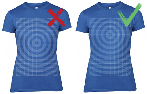
Just like the size of the design, its proper placement is another major factor that impacts the overall look and appeal of the final product. Many times, the wrong placement ruins impressive designs and makes one’s apparel look sloppy and unattractive. The correct placement is again dependent on the size and composition of the design, and in general, a centralized location in the upper half of the t-shirt is a standard position for standard-sized designs.
Incorrect Design Composition
From the complexity of the design to its components (i.e. text, words, images, etc.), every aspect of design composition plays a pivotal role in making it truly impressive. It is important to ensure that every component is appropriately proportioned to add to the overall beauty and aesthetic of the design. Moreover, in the case of text-only designs, it is important to ensure that the message being conveyed is not only meaningful but is also presented in a crisp and catchy manner. Similarly, if the design comprises only images, it should be clear and not be harsh and offensive on the eyes of the beholder.
Printing With Too Many Colors
Printing a design using too many colors can make the final t-shirt look overwhelming and even gaudy. Remember, the more the number of colors used, the higher is the cost of screen printing the design. So, unless it is absolutely essential to maintain the aesthetic appeal of the design, the use of too many colors should be avoided in screen printing. It is advisable to use no more than 2-4 colors for creating an attractive screen printed t-shirt.
Overlooking Contrast Imbalance
Contrast imbalance is the inappropriate difference between the darker and lighter aspects of the design. Ensuring a perfectly balanced contrast is essential for making the design visually pleasing to the eyes of the onlookers. Contrary to popular belief, having the highest contrast is not always the best way to achieve a perfect balance. Rather, it is about ensuring that the lighter parts of the designs are at par with the darker parts, in terms of visibility.
Poor Image Quality
One of the biggest mistakes made by people during online t-shirt printing is that of using poor quality images. This is generally the case when people search and download images online to use them for custom printing on their t-shirts. Most images available on the internet bear a low resolution and although they appear good on screen, reproducing them on fabric may not provide the same result. In order to create truly professional-looking designs, it is important to use high-resolution images.
Working With Outdated Styles
The whole idea behind custom t-shirts is to catch the attention of onlookers. However, by opting for styles and trends that are no longer in vogue will negate this very basic concept and make the final product look boring and outdated. That is why it is important for individuals interested in screen printing to gain detailed information about the latest trends in terms of style, color combination, design composition, and other key aspects. This will help in ensuring that the t-shirt they customize, relays the desired impact and results, when it comes to appealing the audience.
Using Immensely Complex Designs
Many times people feel that going with a design with a higher level of complexity on the t-shirt is an assured way to enhance its appeal. However, complex designs are more difficult to process for the human eye and hence, they are likely to create a far lesser impact when compared to a simple design. This is an important fundamental for people who use screen printing to send out a strong message. Since the onlookers have a limited time to view the t-shirt design, a complex design might end up casting a bare-minimum effect.
Printing On Low-Quality Fabrics
Another major mistake made by people during screen printing is that of using low-quality fabrics for reproducing the design. An amazing design printed on a t-shirt that stems from poor quality fabric is unlikely to create a lasting impression. Moreover, the fabric may also cause discomfort to the wearer – a case where they are likely to give up wearing the t-shirt, thereby putting all the efforts and dimes invested in screen printing to waste. Conversely, a good quality fabric helps in enhancing the overall appeal and virtue of the design on the t-shirt.
We hope that our insights come in handy when you design your own custom apparel. Happy customizing!


